Every time you land on an e-commerce website, a silent psychological battle begins. Retailers spend millions of dollars optimizing their user experience (UX) for a singular purpose: to guide your eyes and your cursor toward full-price inventory.
They use advanced heatmaps, clean minimalist design elements, and clever categorization models to hide their thinnest-margin items—their clearance sections, their hidden coupon pages, and their deepest promotional discounts. If you don't know how to navigate a website strategically, you will succumb to "deal fatigue," overpaying for products simply because the discount path wasn't immediately obvious.
But e-commerce design relies on predictable architectural patterns. By learning how to read the blueprint of a website, you can confidently bypass the marketing fluff and uncover the exact locations of hidden discounts, coupons, and clearance sections. This masterclass breaks down the anatomy of e-commerce layouts, exposes how major retail chains structure their savings, and reveals how to leverage these patterns to save cash on every transaction.
The Core Philosophy: The Red-Text Rule and Semantic Disguises
Before looking at specific layouts, it is crucial to understand the vocabulary of savings. Retail brands choose their deal terminology based on their target demographics and perceived brand value. If a premium department store plastered "CHEAP OVERSTOCK" in a bright neon banner at the top of their page, it would damage their luxury positioning. Instead, brands use intentional semantic disguises.
Furthermore, retailers take advantage of design psychology. Our eyes are naturally drawn to high-contrast visual disruptions. To balance their desire to clear out stock without completely devaluing their regular inventory, smart web developers deploy what is known as The Red-Text Rule.
While the standard navigation links remain uniform in dark gray or black to maintain clean branding, the markdown or discount links are intentionally styled in a vivid accent color—almost always a shade of crimson or burgundy. It provides a visual signal to the bargain hunter while remaining completely isolated from the standard premium browsing experience.
The "Hidden Footer Graveyard" Pattern
Real-World Case Study: Niche & Hobbyist Retailers (e.g., Trampoline Parts and Supply)
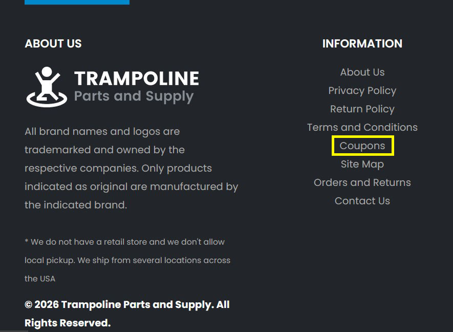 Figure 1.1: Look directly between the informational links at the absolute bottom of the page structure to find hidden promo hubs.
Footer Graveyard
Focuses on scrolling to the base of the page on niche hobbyist sites to bypass corporate styling.
Some retailers choose to keep their primary header navigation completely focused on catalogs, brands, and product lines. In these instances, promotional codes are completely excluded from the top header menu. Instead, developers relegate savings landing pages to the Information Footer Block.
The Architectural Mapping
The primary structural links—such as About Us, Privacy Policy, and Terms and Conditions—are grouped together at the very base of the domain. Tucked cleanly right into the middle of this gray informational block is a direct text link labeled "Coupons".
The Strategy: When navigating niche B2B or specialized hobbyist storefronts, stop looking at the top menu if it feels overly corporate. Scroll straight down to the base of the page. Retailers often generate these dedicated subpages to capture organic search traffic from search engines without distracting premium shoppers during checkout.
The "Category Equalizer" Pattern
Real-World Case Study: High-Volume Seasonal Retailing (e.g., Calendars.com)
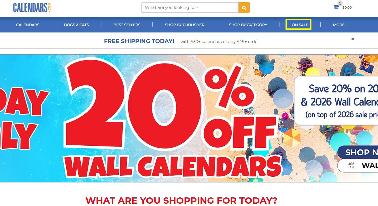 Figure 1.1: Look in the navigation section to find "On Sale" links.
Category Equalizer
Focuses on using advanced catalog filters on high-volume seasonal sites once you enter the "On Sale" bucket.
On high-volume seasonal retail spaces, sales and clearance events are integrated directly into the primary top navigation row as an equal peer to normal categories.
The Architectural Mapping
The text links follow a predictable horizontal grid where categories share equal weight: Calendars, Dogs & Cats, Best Sellers, Shop by Publisher, and right alongside them, "ON SALE".
The Strategy: In this design blueprint, the brand views its markdown inventory as its own self-sustaining catalog. Because it sits on the same visual tier as the main product groupings, this page usually houses excellent filtering options. Once inside an "On Sale" bucket structured like this, immediately filter by sub-category to discover leftover items that are being aggressively cleared out to make room for next season's stock.
The "Dual-Threat Technology" Layout
Real-World Case Study: Consumer Electronics Stores (e.g., Dell Refurbished)
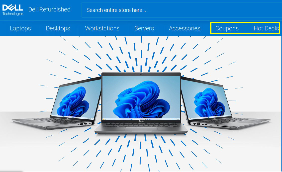 Figure 1.1: Another example of a Coupons and Hot Deals link in the navigation section.
Dual-Threat Tech
Focuses on checking the standalone "Coupons" code page before looking at hardware arrays so you can stack them.
Consumer electronics sites present an entirely different problem for shoppers. Computer systems and accessories have incredibly strict margins, so manufacturers isolate their promotional frameworks into separate, hyper-focused buckets.
The Architectural Mapping
The navigation split occurs at the far right of the primary product row using a two-pronged structural architecture: "Coupons" (revealing current sitewide or item-specific code layers) and "Hot Deals" (a standalone landing page built around flash price reductions or closeout equipment lines).
The Strategy: When buying enterprise tech or computing gear, always check the "Coupons" link first before looking at the discounted inventory items themselves. Tech configurations often allow you to pull an active code from the coupon repository page and apply it over an item already sitting in the "Hot Deals" clearance bucket, letting you stack your savings.
The "Service-Oriented Hospitality" Framework
Real-World Case Study: Travel and Hospitality Hubs (e.g., Best Western)
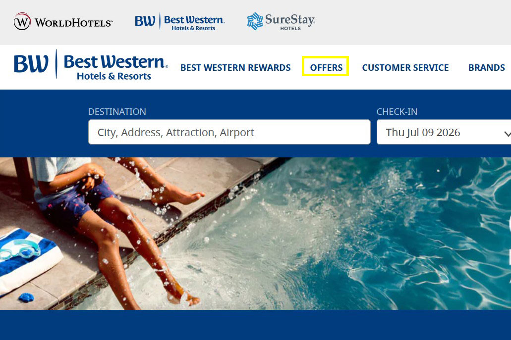 Figure 1.1: Links in the navigation aren't always coupons or sale sometimes look for words like Offers .
Hospitality Framework
Focuses on selecting into demographic brackets (like AAA or senior paths) hiding inside the "Offers" tab.
Service-oriented websites, hotels, and travel platforms don't sell physical boxes, which means they don't have a traditional physical "clearance rack." Instead, their inventory is expiring time. An unsold hotel room or flight leg is a total loss once the date passes.
The Architectural Mapping
To capture flexible budget travelers, hospitality platforms deploy highly streamlined utility headers. The navigation menu maps out its conversion funnel using clean, spaced-out elements: Rewards Loyalty Portals, followed immediately by a prominent text link titled "OFFERS".
The Strategy: On service and travel platforms, the word "Offers" is your golden ticket. These sections do not just contain random promo codes; they house complete packages—such as AAA Member Discounts, Senior Rebates, Government Rates, or Weekend Escape Bundles. Clicking this link allows you to self-select into a specific demographic pricing bracket that lowers the base price of your booking.
The "Highlighted Highlight" Blueprint
Real-World Case Study: Seasonal Apparel & Gear Brands (e.g., Columbia Sportswear)
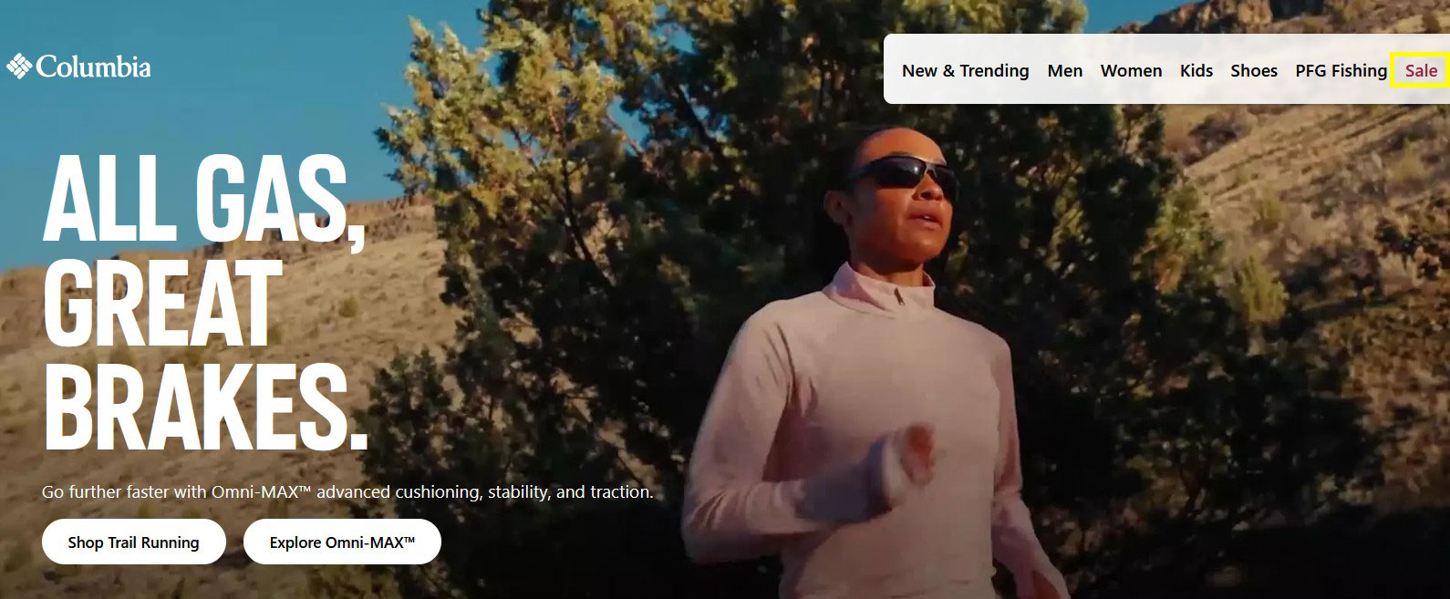 Figure 1.1: Here you will see a sale link in the navigation highlighted in red.
Highlighted Highlight
Focuses on watching for sudden seasonal inventory purges signaled explicitly by high-contrast red font variations.
Outdoor apparel and gear brands often have to combat massive inventory shifts as seasons transition from summer lines to technical winter gear. Because clearing out old inventory quickly is critical for cash flow, developers intentionally break standard UI design cohesion to grab your attention.
The Architectural Mapping
The links run horizontally in standard dark corporate fonts for general categories (e.g., Men, Women, Kids). But immediately following their core lines, the word "Sale" or "Clearance" is rendered in an explicit, high-contrast red font choice.
The Strategy: This is a classic implementation of the Red-Text Rule. When an e-commerce platform explicitly recolors a single element in their top navigation row, it means they are currently overstocked and are aggressively pushing traffic to markdown landing pages. These sections are prime targets for deep site-wide category cuts (often reaching 40% to 60% off original retail pricing).
The "Omnichannel Retail Aggregator" Grid
Real-World Case Study: Multi-Department Mega Stores (e.g., Macy's)
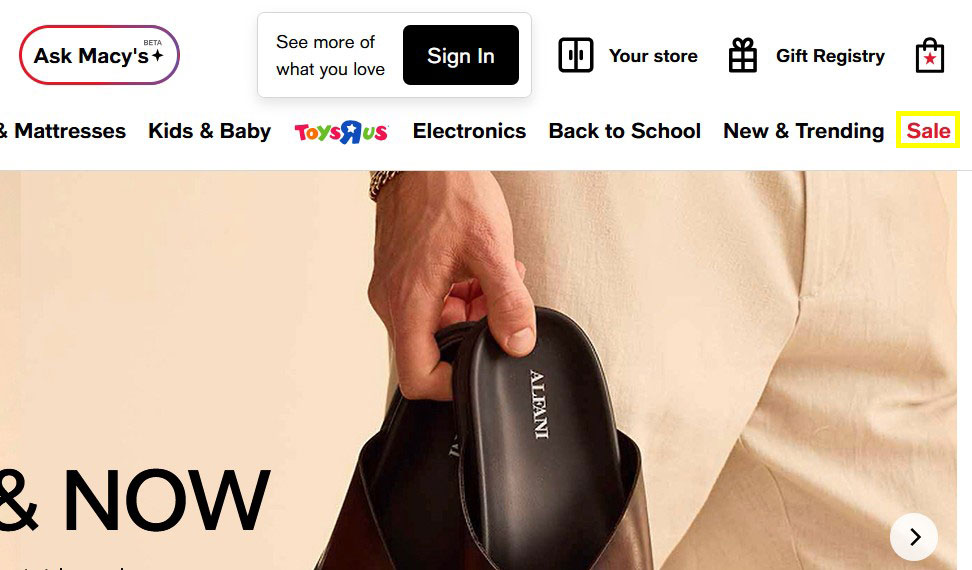 Figure 1.1: Another example of a link in navigation that is highlighted red with sale.
Omnichannel Grid
Focuses on navigating dense department store drop-downs by filtering explicitly for terminal categories like "Last Act" or "Closeouts".
Massive multi-department department stores have thousands of brands running concurrent promotions. Their headers are naturally complex, featuring internal search tools, loyalty portals, and massive category trees.
The Architectural Mapping
The desktop navigation system balances an incredibly dense interface by leveraging both a prominent search bar and a multi-tiered category row. Following extensive columns of clothing categories and home goods, the menu wraps up with its terminal elements featuring a bolded "Sale" option highlighted in bright red text.
The Strategy: In massive department stores, the red "Sale" anchor link is typically a gatekeeper to an extensive clearance hub. Because these hubs are so large, navigating them blindly can be overwhelming. Once you click a prominent red header link on a department store site, look for secondary filtering sidebar arrays. Filter specifically for "Last Act" or "Closeouts" to separate standard 10% markdowns from final clearance inventory.
The Core Navigation Comparison Matrix
| Site Style | Target Link | Location Zonation | Visual Trait | Strategic Use Case |
|---|---|---|---|---|
| Specialized B2B / Niche | Coupons |
Bottom Footer Menu | Low-contrast text block | Captures organic search traffic; isolates discounts from premium buyers. |
| High-Volume Catalog | On Sale |
Main Navigation Row | Standard Category Peer | Treats clearance stock as its own separate product catalog tree. |
| Consumer Electronics | Coupons / Hot Deals |
Header Right Margin | Divided multi-links | Separates active code verification fields from flash price reductions. |
| Hospitality & Travel | Offers |
Utility Row Grid | Clean Uppercase Styling | Houses structural demographic bundles (AAA, corporate, senior rates). |
| Seasonal Apparel | Sale |
Inner Menu Flow | High-Contrast Red Font | Directs immediate consumer volume to aggressive inventory clearance blocks. |
| Mass Department Hub | Sale |
Terminal Row Edge | Bolded Crimson Text | Acts as the core tracking gateway to multi-layered markdown hubs. |
Cracking the First-Visit Popup: The Welcome Discount Game
Beyond tracking down hardcoded links in the header and footer, there is another universal design pattern that you will encounter on almost every modern e-commerce storefront: The First-Visit Modal Popup.
The moment you land on a new store, a script tracking your cookies detects that you are a new visitor, instantly graying out the screen and launching a large overlay window. Retailers don't do this out of pure generosity. They know that customer acquisition is the hardest part of digital commerce. By trading a 10%, 15%, or 20% discount code on your first order, they gain something far more valuable: a direct line of communication to your email inbox or smartphone via SMS messaging.
Insider Strategies to Overcome the Data Exchange
-
The Burner Email Shield: Never use your primary personal email account for retail popups, or your inbox will quickly fill up with daily marketing blasts. Instead, set up a dedicated, free email address solely for shopping discounts (e.g.,
[email protected]). This keeps your main inbox clean while ensuring your one-time discount codes are organized in a single searchable place. -
The Burner SMS Pivot: Many brands now offer their highest tier of savings (like a flat $20 off or 20% sitewide) only if you sign up for mobile text alerts. If you don't want marketing texts buzzing your phone at dinner, use a free Google Voice number or an alternative messaging app number to collect the confirmation code, grab the coupon string, and then text
STOPimmediately to unsubscribe. - The "Incognito" Re-Trigger Rule: Did you close out a popup window, only to realize later that you actually want to make a purchase? Simply open up a clean Private Browsing or Incognito window, copy-paste the store's URL, and the site's tracking scripts will treat you like a brand-new visitor, serving up the coupon popup all over again.
3 Pro-Level URL Shortcuts and Search Hacks
If a brand has completely stripped its interface of any obvious discount text, you can use your browser's address bar and internal site search engine to uncover hidden pages.
Hack #1: Direct Path Guessing
Many modern e-commerce content management systems (like Shopify, WooCommerce, or Magento) generate predictable, automated URL paths for marketing pages, even if a designer forgot to link them in the main menu. If you are stuck, append these common extensions directly onto the root domain name in your browser bar:
storename.com/clearancestorename.com/salestorename.com/couponsstorename.com/promostorename.com/offers
Hack #2: Internal Search Manipulation
Most people use a website's internal search bar to look for a specific product name or SKU. Instead, try entering broad sales triggers into the search box to force the backend database to return markdown inventory. Try searching for terms like: "Clearance", "Closeout", "Overstock", or "Liquidated".
Once the results load, immediately navigate to the sorting dropdown menu and switch the configuration from the default Featured view to "Price: Low to High" or "Percentage Off: Highest to Lowest". This forces the deepest, most aggressive clearance markdowns straight to the top of your product viewing grid.
Hack #3: Google Site-Specific Scrapes
If a website's internal search engine is slow or poorly configured, you can use Google to index only that specific retail domain for discount pages. Go to Google and use the site: operator, followed immediately by the store's web address and your target discount keywords.
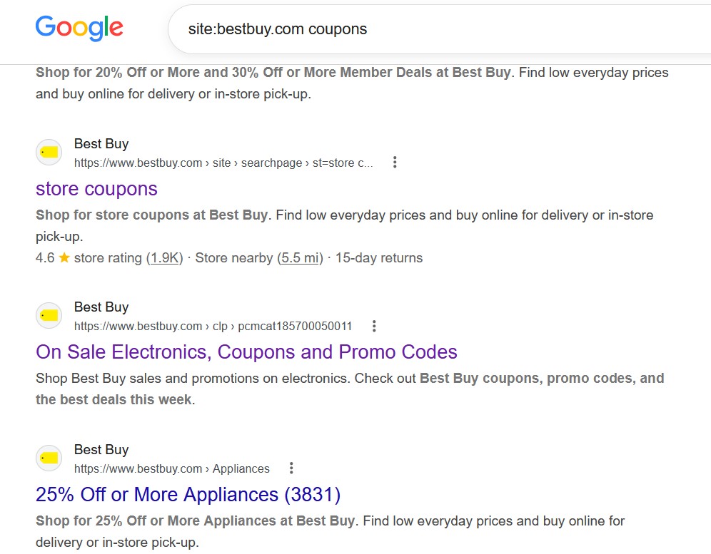 Figure 1.1: Here's a representation of deep links you can find on a website like Best Buy.
The Strategy
Scroll straight to the bottom row on niche B2B storefronts to capture search index URLs...
This commands Google to filter out the rest of the web and return every hidden index page, PDF weekly circular, or terms-and-conditions deal sheet hosted on that specific retailer's servers.
The Smart Shopper's Pre-Flight Checklist
Before clicking the final "Place Order" button on any online checkout screen, run through this quick framework to make sure you aren't leaving money on the table:
- Audit the Header Rows: Is there an active color-shifted red accent link or dedicated "Sale" category layout option?
- Scan the Footer Graveyard: Are there low-contrast fine-print text links for "Coupons," "Outlet," "Overstock," or "Factory Seconds"?
- Maximize the Popup Layer: Have you grabbed the introductory welcome code using a secure shopping burner address?
-
Test the Platform URL Pathing: Did you manually append paths like
/clearanceor/couponsdirectly into your primary address bar? - Invert Internal Site Search: Have you queried standard keyword modifiers and sorted the product grid from lowest price to highest?